Bloome
UX/UI Case Study

TOOLS USED:
Figma, Adobe Illustrator
SKILLS:
User Research, User flow, User journey mapping,
Wireframing, Prototyping, Usability testing, Branding.

Bloome is a non-surgical aesthetic medicine treatment center located in Barcelona. Their goal is to demystify aesthetic medicine, achieve natural results and reach a broader audience to focus on the prevention and prolongation of natural beauty.
Design Thinking Process
Emphatize
Define
Ideate
Prototype
Test
User Research
User Survey
User Interview
User Persona
Problem Statement
Brainstorming
Card Sorting
User Flow
Wireframing
UI Design
Usability tests
Improvements
Revamp the user interface to evoke a sense of naturalness and freshness. Create an aesthetic that welcomes new clients, ensuring they feel comfortable and at ease while navigating through the website.

Understanding Co-Founder needs
After a kick off conversation with Manu Caldas, the Co-Founder of Bloome, we defined the scope of the project:
Enhance the user experience to simplify the understanding and filtering of treatments. Ensure a seamless journey for users to access all necessary information providing a secure and straightforward path to make an online purchase.

I trust reviews from respected magazines because they assure me of a reliable place. This highlights the importance of both Google reviews and user testimonials in shaping my confidence.
Increase the number of photos and videos from users who have experienced it, and enhance the visibility of contact options.
Revise the understanding and concept of the 'Blog' section.
Establish a fixed price and enhance the navigation for a more straightforward experience.
Establish a fixed price and enhance the navigation for a more straightforward experience.
Having a contact form for questions is handy, and I like that I can use WhatsApp to communicate.
Bloome Website insights
If i see reviews made by a magazine i trust more. asurance its a good place to go. Trust in Google reviews and the importance of user testimonials
Pink, white, clean, skin colors.
The website creates a friendly and authentic atmosphere, emphasizing that there's no need to look perfect. Instead, it celebrates individuals who look like real people.
Glows
Three image categories. I prefer the cool ones with flowers, as they appear more natural. The other images are inconsistent and seem accidental, lacking intentional thought. The smiling image at the bottom gives off a dentist vibe.
The outlined icons give off a professional consulting or financial institution vibe.
A good Google rating is positive, but if it's consistently at the top, it may raise suspicions.
Grows
"I'm a bit confused about how some aesthetic treatments work and whether they're safe for me.”
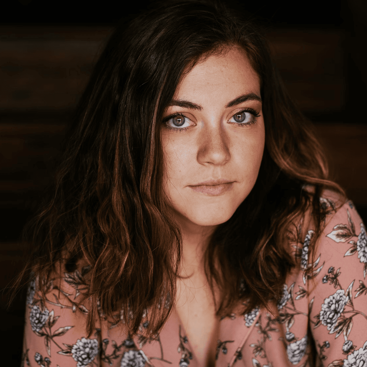
User persona
Anna, 32
Anna Canet lives in a small neighourhood in Barcelona.
She loves combining her busy work life with the feeling of discovering new places around the world.
Until two years ago she had never worried about her skin quality but then she started detecting some new wrinkles and little stains.
Frustration
Since she turned 30, she has begun to detect some changes in the quality of her skin. She has never had any cosmetic treatment so she is not entirely sure if it would be a good decision to enter this world.
Goal
Find an aesthetic treatment adapted to her with natural results, that resolves her small new concern and make an appointment to receive medical advice.
See Treatment

Ideation
We did several rounds of ideation on possible features to improve the search and filtering of treatments.
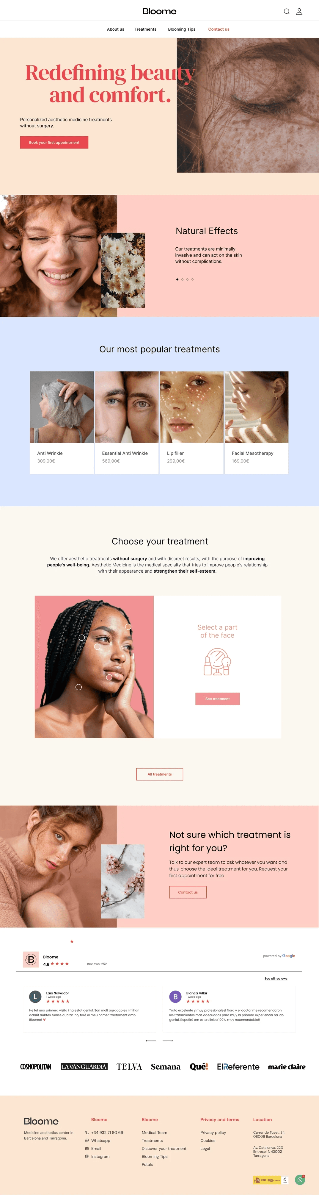
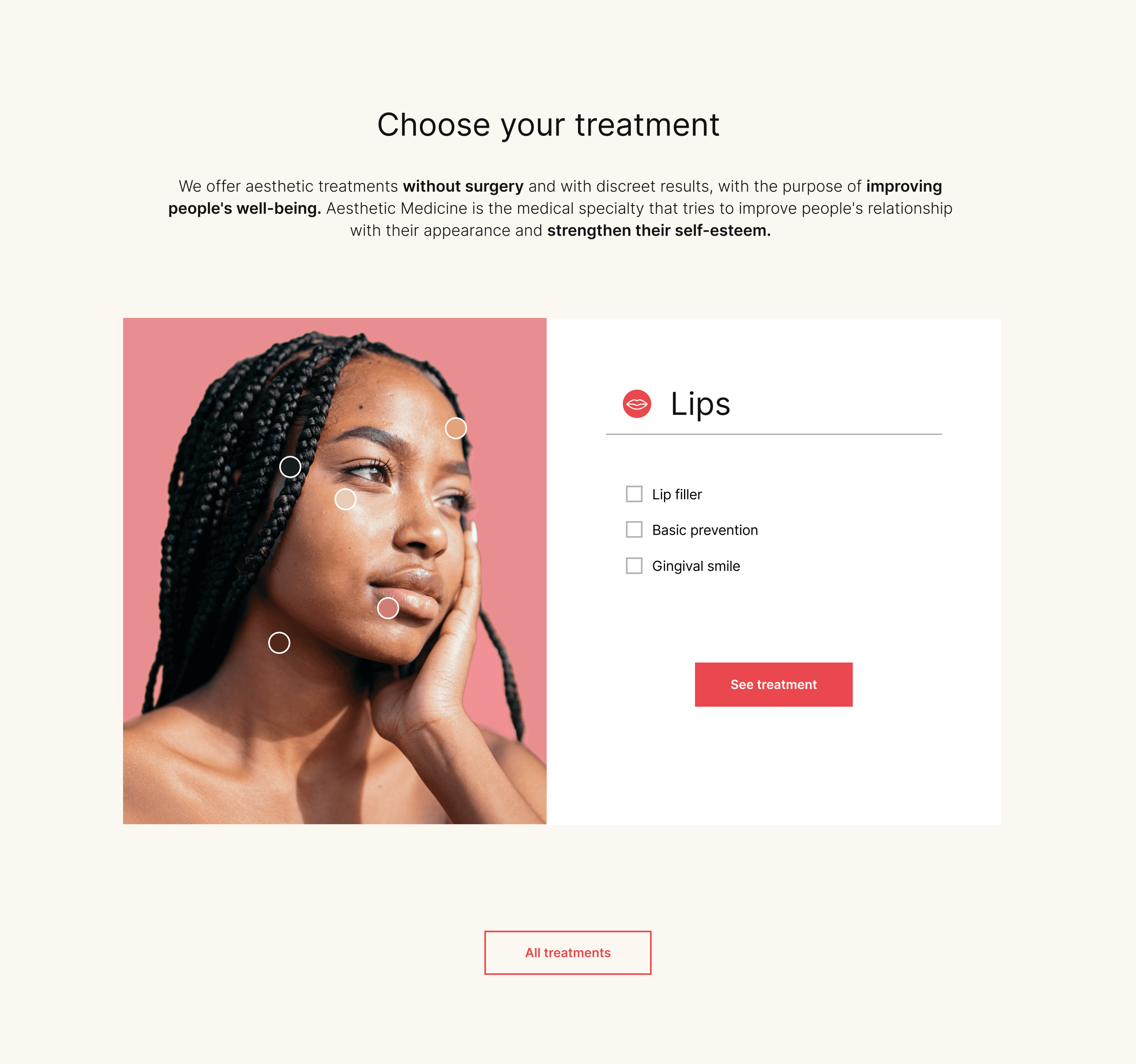
Finally we decided to include a Facial Map where the user could select a face area and choose an specific treatment.
Wireframes
Our main feature capable of solving the initial problem is the Facial Map. However, through several rounds of testing with Mid-Fidelity wireframes we restructured the information on the Home Page and an specific treatment page. Our goal was for the user to find the necessary to make the decision to make the purchase online without having to be present in the clinic.
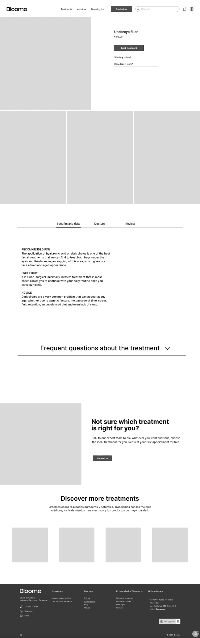

We opted for a minimalistic and versatile typography for the text, the Barlow.
The logo is created from the typography MuseoModerno. We loved the movement sensation of it’s X and we added sun rays as a symbolism of the new beggining expats face.
We paired it with lively purple and salmon colors to achieve a fun and vivid appearance.
To create a cozy and bright feel, we dedicated time to select the icons and crafting image collages with playful doodling.

Beauty
and comfort.
Choose your treatment
We offer aesthetic treatments without surgery and with discreet results, with the purpose of improving people's well-being.
Book treatment


All treatments
Brand identity

Contact option
Related Treatments
FAQ’s
Treatment Procedure Information
Booking process
Client Reviews
Treatment filter:
Facial Map
Final solution
After applying the new visual identity to both screens we conducted several tests to confirm that the general feelings when navigating them were similar to the brand attributes: reliability, warmth, closeness and femininity.
Although the user can go to the treatments page from the menu, the facial map feature serves as a more clarifying filter, allowing the user to choose a specific part of the face and find out directly about a specific treatment.

Bloome Key Strengths
Contact
Testimonials
Book a first free appointment
Let’s work together!
CONTACT